
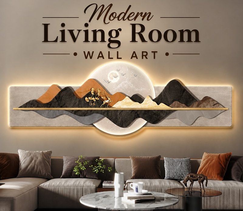
Wall art in a living room does more work than most homeowners give it credit for. It establishes the mood of the space before a single piece of furniture is noticed. It anchors the furniture arrangement beneath it. It introduces colour, texture, and personality in a way that paint and upholstery alone cannot achieve. And in a room that is otherwise resolved — good sofa, good lighting, considered palette — the right piece of wall art is often the element that makes everything else feel complete.
The challenge is that choosing art for a living room involves decisions that most people have not been taught to make: scale, proportion, placement height, the relationship between the artwork and the furniture beneath it, and how to build a wall arrangement that reads as curated rather than accumulated. This guide covers all of it — from the current direction in modern living room wall art to the practical sizing rules and placement techniques that make art work in any space.
What Is the Current Direction in Modern Living Room Wall Art?
The dominant shift in living room wall art right now is a move away from the gallery wall — the multiple-frame arrangements that defined interiors throughout the 2010s — toward a single, oversized statement piece that anchors the room with confidence and clarity.
The logic behind this shift is straightforward. A gallery wall filled with many small frames requires significant effort to arrange, creates considerable visual complexity, and often produces a wall that looks busy rather than considered. A single large artwork above a sofa does the same structural work — anchoring the furniture, defining the mood of the room, providing a focal point — with a simplicity and boldness that a collection of smaller pieces cannot match.
This preference for fewer, better pieces reflects the broader design direction toward warm minimalism and Japandi-influenced interiors, where the quality and intention of each object matters more than the quantity of objects present. A wall with one significant artwork above the sofa and nothing else on the remaining walls reads as deliberate and contemporary. The same wall with three medium-sized frames in an asymmetric arrangement can read as indecisive.
The current colour direction in living room wall art also reflects the broader interior design palette shift. Cool grey, stark black-and-white, and sharp graphic art are being replaced by warm neutrals — beige, taupe, cream, warm ochre — alongside organic shapes, natural forms, and the kind of textured, handmade quality that signals craftsmanship rather than reproduction. Abstract art in warm tones remains the most versatile and most consistently searched category of modern living room wall art, because it adapts to a wide range of interior palettes and styles without dating as quickly as figurative or illustrative alternatives.
What Size Should Living Room Wall Art Be?
Sizing is the decision that most homeowners get wrong, and almost always in the same direction: too small. A piece of art that seems appropriately sized in a gallery or on a product page frequently looks undersized once hung in a real room, where the scale of walls, furniture, and ceiling height creates a context that a single photograph cannot convey.
The most reliable sizing rule for art above a sofa — the most common placement in any living room — is that the artwork should span approximately two-thirds of the sofa’s width. Above a standard sofa of 180 to 200 centimetres in width, that means looking for artwork with a canvas or frame width of 110 to 130 centimetres. A single piece at this scale creates a strong visual anchor. Multiple smaller pieces grouped together to achieve this width are considerably less impactful than a single oversized canvas.
For wall art hung above a console table, fireplace mantel, or sideboard, the same two-thirds proportion applies. The artwork should feel related to the furniture beneath it — not so narrow that it floats above the piece without connection, and not so wide that it extends significantly beyond the furniture’s edges.
For a large blank wall with no furniture immediately beneath it — a feature wall visible from the main seating area, or the wall facing the sofa across a generous room — artwork scaled to fill 60 to 75 percent of the wall width creates the most confident and resolved result. When in doubt, scale up. Sizing mistakes in art almost always go in the direction of too small rather than too large.
What Makes Abstract Art So Popular for Living Rooms?
Abstract art remains the most consistently popular category of modern living room wall art, and the reasons are practical as much as aesthetic. A well-chosen abstract painting in warm, neutral tones adapts to a wide range of interior palettes without clashing with existing colours or competing with the room’s other visual elements. It invites personal interpretation rather than directing attention to a specific subject, which gives it a psychological openness that figurative art does not always achieve. And it does not date in the same way as illustrative or trend-driven alternatives — a quality abstract painting looks as relevant after ten years of hanging as it did when it was first installed.
The abstract art direction that currently dominates modern living room design combines organic forms with warm, earthy tones — cream, warm beige, soft terracotta, clay, dusty sage, warm charcoal. These compositions reference natural textures and landscapes without depicting them literally, creating the biophilic connection that current interior design consistently prioritises without the literalness of a botanical illustration or a landscape painting.
Textured abstract art — where the paint surface itself is built up into visible, tactile relief through the use of palette knife, mixed media, or impasto technique — is particularly strong right now because it brings three-dimensional depth to a wall that flat canvas cannot achieve. A textured canvas catches light differently throughout the day as the room’s light changes, making the artwork a genuinely dynamic presence rather than a static decorative object.
Is Oversized Statement Art Right for Every Living Room?
A single oversized canvas or print is the modern living room wall art solution that produces the most immediate and the most resolved result — but it requires a wall and a furniture arrangement that support it.
The wall above the sofa is the most natural placement for an oversized piece, and it works in most living rooms because the sofa provides the necessary horizontal anchor below the artwork, preventing the large piece from floating without context. The sofa must be pushed close enough to the wall that the artwork reads as belonging to the seating arrangement rather than hovering above it in empty space.
In open-plan living spaces, an oversized artwork on the wall visible from the main seating area creates a focal point that the open layout would otherwise lack. Without a fireplace or other architectural feature to anchor the room, a very large canvas — two metres wide or more in a generous space — performs the structural role of a focal point that the room’s architecture cannot provide on its own.
For smaller living rooms, very large artwork can feel overwhelming if the room’s proportions cannot accommodate it. In a compact room, a statement piece of 90 to 120 centimetres in width, hung at the correct height and with appropriate breathing space around it, achieves the impact of an oversized piece without consuming the visual space of the room.
How Do Gallery Walls Work in a Modern Living Room?
The gallery wall is not finished — it has simply been edited. The multi-frame arrangements of the 2010s, which frequently included dozens of frames in mixed sizes, mixed finishes, and mixed subjects, have evolved into something more considered: smaller collections of three to seven frames, more consistent in their colour palette and framing, with more breathing space between each piece.
A modern gallery wall works through coherence rather than variety. Choosing frames in a single finish — all natural wood, all matte black, or all antique gold — gives the collection a visual consistency that allows the artwork itself to vary in subject and scale without the arrangement looking chaotic. Keeping all pieces within a shared colour palette — a collection of botanical prints in dusty green and cream, or a series of abstract pieces in warm neutral tones — produces the same effect.
The three-piece arrangement — three canvases or frames in a horizontal row, or staggered at slightly different heights — is the most versatile and most beginner-friendly gallery wall format. A grid of six frames in two rows of three, with consistent spacing between them, produces a more formal and more polished result suited to living rooms with traditional or transitional architecture.
The rule about spacing is simple and consistently underestimated: the gap between frames in a gallery arrangement should be consistent across all pieces and between the arrangement and any nearby door frames or architectural features. Inconsistent spacing makes an arrangement look careless even when the artwork itself is well-chosen.
What Is Textured and Sculptural Wall Art?
Beyond flat canvas and framed prints, modern living room wall art increasingly includes three-dimensional and sculptural elements that bring physical depth to the wall surface. Woven wall hangings in natural fibres, ceramic wall panels, metal relief sculptures, carved wood panels, and preserved moss arrangements all qualify as wall art in the broadest current sense of the term.
These three-dimensional pieces work particularly well in living rooms that lean toward natural, organic, or biophilic aesthetics, where the emphasis on natural materials and tactile surfaces extends naturally from the floor and furniture to the walls. A large woven wall hanging in undyed wool above a linen sofa, or a series of ceramic wall pieces grouped on a limewashed wall, brings the material richness of the room’s palette to the vertical surfaces in a way that flat canvas cannot.
In living rooms with otherwise neutral and restrained decoration, a single sculptural wall piece provides the kind of material interest and visual complexity that prevents a pared-back room from feeling empty. It adds depth without adding colour, warmth without adding pattern.
What Is the Correct Height to Hang Living Room Wall Art?
The most consistent mistake in hanging wall art, in living rooms and throughout the home, is hanging it too high. Art hung at the correct height should have its centre at approximately 145 to 150 centimetres from the floor — roughly average eye level when standing. At this height, the artwork feels integrated into the room at human scale, as though it belongs to the space it occupies.
Art hung significantly above this height floats above the room, disconnected from the furniture and from the people in it. This is particularly common above sofas, where the instinct is to hang the art high enough to clear the sofa back comfortably. The correct approach leaves a gap of 15 to 25 centimetres between the top of the sofa back and the bottom of the frame — close enough that the artwork and the sofa read as part of the same visual arrangement.
When art is hung above a fireplace mantel, the bottom of the frame or canvas should sit 10 to 15 centimetres above the mantel surface, keeping the artwork in close relationship to the architectural feature rather than floating above it.
How Much Space Should Surround a Piece of Wall Art?
The breathing space around a piece of wall art affects how it reads as much as the artwork itself. Art hung with insufficient space around it — jammed between two door frames, or crowded by adjacent furniture — looks smaller and less significant than the same piece in a more generous context.
The principle is that the visual weight of the surrounding empty wall should balance the visual weight of the artwork. A large canvas on an otherwise empty wall can fill a generous proportion of the wall surface without looking crowded. The same canvas on a wall already busy with a mirror, a shelf, and several smaller frames will look competing rather than statement-making.
In practical terms, allow at least 30 centimetres of empty wall on all sides of a piece of artwork intended to read as a statement. For an oversized canvas above a sofa, the canvas should not extend to within 30 centimetres of any door frame, window reveal, or side wall. If the room’s dimensions do not allow this, a smaller piece hung in the same position will read better than an oversized piece that is visually compressed by its surroundings.
What Are the Best Modern Living Room Wall Art Ideas by Style?
What Wall Art Works in a Minimalist or Warm Minimalist Living Room?
In a minimalist or warm minimalist living room — the aesthetic that currently dominates modern interior design — wall art should do its job quietly and well without competing for attention with the room’s material palette. A single large canvas in warm neutral tones, hung above the sofa with nothing else on the surrounding walls, is the most resolved approach. The artwork provides the focal point and the emotional warmth that pure minimalism struggles to produce on its own, while the restraint of a single piece maintains the visual calm that the style requires.
For a Japandi-influenced living room specifically, the artwork should work through restraint. Muted tones — warm beige, soft charcoal, clay, sage — with compositions built around negative space and natural forms. A single 90 by 120 centimetre canvas in warm neutral abstract tones, framed in natural oak or matte black, hung at eye level above the sofa, is the most characteristically Japandi approach to living room wall art available.
What Wall Art Works in a Traditional or Period Living Room?
In a traditional living room — particularly one in a Georgian, Victorian, or Edwardian property where the existing architecture provides strong character — wall art should relate to the period vocabulary of the room without being constrained to historical subjects.
Botanical illustrations, landscape paintings, and portrait-style artwork in gilt or painted frames relate naturally to the period architecture of these rooms. But the most successful contemporary approach to period living rooms combines traditional framing with contemporary subjects — an abstract painting in warm neutral tones in an antique gold or deep timber frame, for example, sits entirely comfortably in a Georgian room with original cornicing without looking as though it was placed there by accident.
Oil paintings and works on canvas have an inherent material quality that prints and reproductions cannot replicate, and in a period room where the quality of materials is central to the architecture’s identity, original artwork — even by an unknown artist, at a modest price — tends to read more appropriately than a high-quality print.
The picture rail, present in most Victorian and Edwardian rooms, is both a practical and an aesthetic tool for wall art in period living rooms. Hanging artwork from the picture rail using appropriate hooks and cord — rather than from wall-fixed fixings at a fixed height — allows flexibility in arrangement, preserves the plaster beneath the rail, and relates directly to the architectural purpose the rail was designed to serve.
What Wall Art Works in a Contemporary or Modern Farmhouse Living Room?
Contemporary and modern farmhouse living rooms accommodate a wider range of wall art styles than either minimalist or traditional interiors, but the most effective choices share the same characteristics: natural materials, warm tones, and visible craftsmanship.
Large-format photographic prints of landscapes, botanical subjects, or architectural details in warm tones, framed in natural timber or simple metal, work well in contemporary spaces. Abstract paintings with visible texture and organic forms suit both contemporary and farmhouse-influenced rooms. Woven wall hangings and natural fibre pieces relate to the material palette of modern farmhouse interiors particularly well.
The approach to gallery walls in these styles is more relaxed than in traditional or minimalist rooms. A mixed arrangement of frames in complementary natural finishes, combining artwork with personal photographs and a small mirror or shelf, produces the layered, collected quality that modern farmhouse and eclectic contemporary interiors aim for.
What Are the Most Common Living Room Wall Art Mistakes?
Hanging art too high is the most common and most correctable mistake in living room wall art placement. The instinct to hang art higher than eye level produces artwork that reads as though it belongs to the ceiling rather than to the room, and the correction — lowering it to 145 to 150 centimetres at the centre — is immediate and free.
Choosing artwork that is too small for the wall or the furniture beneath it is the second most consistent error. A frame that seems generously sized on a product page or in a gallery frequently looks undersized once hung in a room with real dimensions and real furniture. The two-thirds-of-the-sofa-width rule is the most reliable corrective for this instinct.
Mixing too many frame finishes and artwork styles in a gallery arrangement produces visual noise rather than curated layering. Choosing one frame finish and one shared palette for all pieces in an arrangement, even if the subjects and scales vary, is the simplest path to a gallery wall that looks composed rather than assembled.
Over-accessorising the wall beneath or beside a significant piece of artwork dilutes the impact of the piece. A statement canvas above a sofa should not compete with a shelf of objects on the adjacent wall, a large mirror on the opposite wall, and a collection of smaller frames on the remaining wall surface. Letting statement art breathe — with clear wall space around it — is the decision that most often separates a room that looks designed from one that looks busy.
How Do You Choose Modern Living Room Wall Art That Lasts?
The most honest guidance on choosing living room wall art that remains satisfying over time is to choose based on how the piece makes you feel in the room rather than on its alignment with a current trend. Trends in wall art rotate on approximately two to three-year cycles. A piece chosen primarily because it is fashionable now is likely to begin feeling dated within that window.
The wall art that homeowners consistently describe as still feeling right after five, ten, or fifteen years of living with it shares certain characteristics. It has material quality — visible texture, depth, or craftsmanship that justifies looking at it closely. It works within the room’s colour palette without being so precisely matched that it reads as a paint chip accessory. It provokes a genuine emotional response — calm, curiosity, warmth, pleasure — rather than merely fulfilling a decorative function. And it is scaled correctly, so it reads as confident and chosen rather than placed because something was needed.
Original artwork, even at a modest price point — from online platforms, local artists, art fairs, and auction houses — consistently outperforms prints and reproductions on all of these criteria. The material presence of an original oil or acrylic painting, a hand-drawn illustration, or a unique mixed-media piece carries a quality that the most technically excellent reproduction cannot replicate, and it is that quality of presence that makes a piece of wall art feel genuinely at home in a room rather than merely decorating it.